A Little Tech Talk
Good morning dear reader.
In my series of sporadic pontifications on the state of digital photography, I have written often that it is wrong to pillory photographers, Photoshop users; or indeed the whole art of photography; for the bad work of the inept and the downright incompetent, when discussing high quality photo-finishing.
I have written angrily and lengthily about the hysteria that seems to have gripped the internet with the misguided notion that “To Photoshop” (itself an interesting grammatical perversion) something, is in and of itself a crime against humanity. These loud tub-thumpers claim, in their ignorance, that photographers and retouchers by doing what they do to their photographs are making the poor sensitive souls have impossible expectations of their bodies and giving them unrealistic and unachievable body examples and therefore making them feel inadequate and belittled!
Ahhh! Poor little darlings.
I have been posting some work in progress on these pages to show the importance of the process to photographers in order to present an image that is actually worth looking at.
Every photographer knows that no matter how beautifully you light a subject, no matter how perfect the sitter, how perfect their make up and styling, how perfect the whole camera image, there is always more to be done before it can be called a finished photograph. This process by nature involves a great deal of expertise and more than a little vision and subtlety. Now each photographer, being an individual artist, is given to techniques that in a very final sense define what we like to call their visual style. But, and it is vital to understand this, each photograph also guides you toward certain decisions on how it needs to be realised.
This constitutes a set of directions that are too numerous and amorphous a set of aesthetic/technical parameters to list in any comprehensive way. But what they all have in common are two or three key questions that need to be answered before one can proceed any further.
1: What is the subject?
2: What is the purpose?
3: What is the story?
There are as I said many many more factors that come into play, but these basic three are common to all projects.
As you may have noticed recently I have started work on a project with a designer to photograph her new range of jewellery for her soon to open website; with a view to becoming the official brand photographer on a long term basis. She had been shown my WOMAN series and liked the work and approach. So we met and she asked me to do a few test shots in my style to see if we could work together. Anyway that is the basic reason for the shots I have been uploading to this site lately.
I worked with two of my sitters from the WOMAN series. The first shoot with Sofia already yielded one perfect image which will appear on the designer’s site. The next set was with Giota with whom I only recently finished a very large set for the WOMAN series. The designer, Manalé, really liked her and asked me if I could add a photo of her jewellery to an existing image of Giota. Now me being against that kind of faking, suggested that I arrange a shoot with Giota to get the real thing done. She agreed, as did Giota. And so here we are.
I have been processing the shots to get to what I would consider the perfect shot to combine my own style and requirements for realism, with the parameters and requirements of the fashion world. The two things don’t necessarily sit perfectly together, since fashion photography has become a rather narrow definition; and especially when we are talking about high fashion. Nonetheless I wanted to try and make this fusion work. My method of photographing “real” women for my own project meant that I photographed women who are not models and in most cases have never been photographed professionally at all. They are also mostly good friends of mine which adds another dimension to the shots.
Translating this methodology to the needs of fashion design means a good deal of tweaking. So now I would like to post one of the main images of the set with Giota, that I consider a key shot for the jewellery series, and my processing decisions to reach what I wanted to present as a final photograph.
The following (photo: a) two images show I obviously had the full range of the scene on neg, but if I did an over all opening up of the image I would simply burn out the highlights, or lose the range of the mid-tones. What I needed was a balance of the two while retaining the integrity of those vital mid-tones. Given the tendency of digital images to burn out at the highlights I usually favour exposing for the highlights and then correcting for the shadow and mid-tone to give the correct gamma for the entire image. In the old days this would have meant a long and complicated process of inter-negatives, masks and a great deal of technical interference to reach ‘Image #1′ below. For that, thankfully we now have Photoshop.
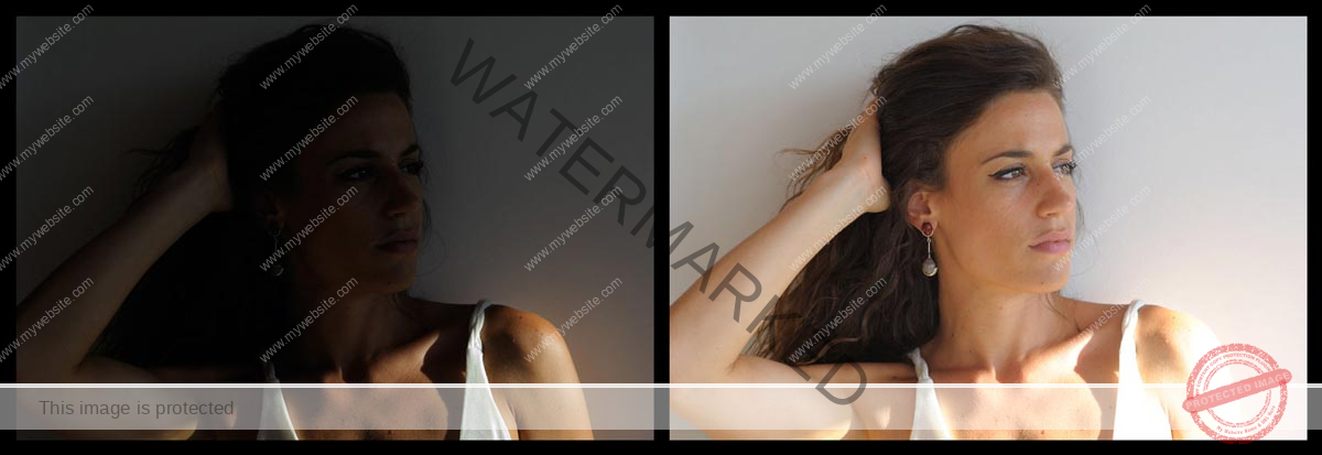
a: Two ways the image could be made from the RAW “negative” one favouring the highlights and the other the shadows.
As you can see I balanced out the contrasts and cleaned up the colours to a level where the image had an appearance that was correct and true to the scene. My intention for the image was to convey a certain drama and mystery, a sort of Film Noir quality, which this on its own obviously does not bring out.
In ‘Image #2‘ I have played with the colour and contrast to a level that really now the image is in many ways finished. To all intents and purposes this can be presented as the final image. But I wanted to push the atmosphere and drama levels still further.
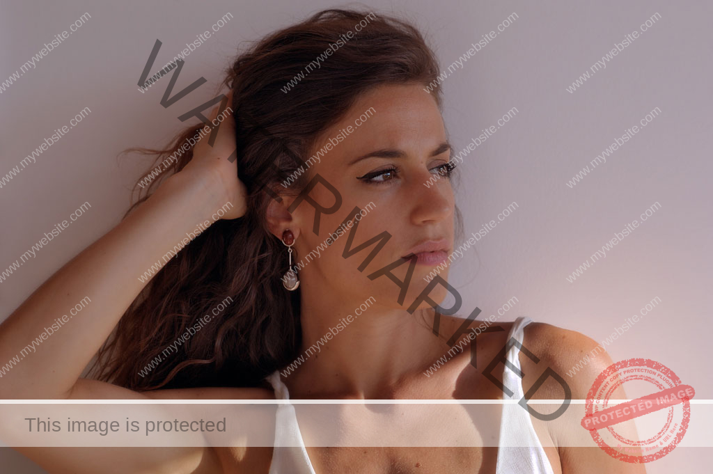
Image #1: This is the first processed image from the RAW “negative”. It was a harsh lighting situation and therefore I had to make certain decisions in camera not to lose shadow or highlight details.
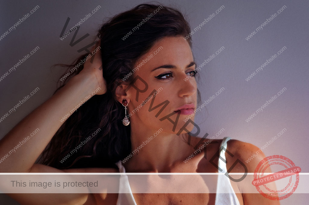
Image #2: This is the next step taking the contrast and levels of saturation and colour balance to where I thought the image needed to go.
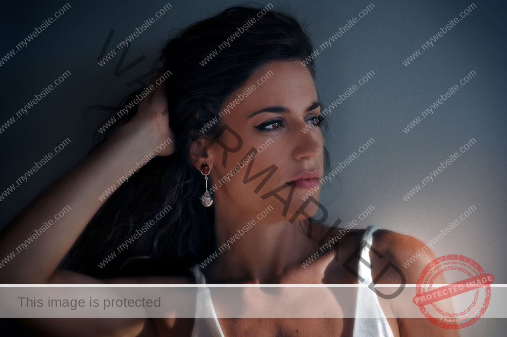
Image #3: This one with its slightly muted but deeper colours and heavier contrast is in basic terms what I wanted to see with this image. The rich shadows and colours were what I was aiming for to reach the kind of quality and impact I felt the image needed.
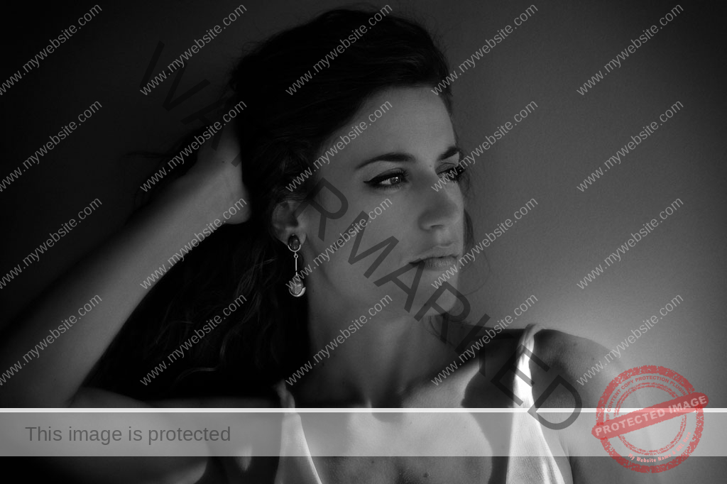
Of course it is never a complete image unless there is a black & white version too. Anyway the client wants to show the images in black & white. So here is the B&W version.
This was where I wanted to take it. In some ways every photograph is an eternal work in progress, as time goes on a shot you once considered perfect, begins to draw you back with new ideas of how you can treat and present it. But for the moment I believe I have reached where I want to go with this in colour.
Here, as they say endeth the lesson. Not much of a one I admit, but hey if people want they can pay me and I will provide full workshops on technique and aesthetics any time.
I would like to present this article as a kind of an answer to the critics who blanket condemn Photoshop and photographic techniques for all the wrong reasons. As any one must see from the very first image, the subject, Giota is naturally beautiful and I have committed no drastic surgery on her to make an idealised image of unattainable perfection. This is what she looks like. Compare them all you want, you can criticise me for my aesthetic, for my techniques, for my colours, for my taste, for my personality if you must. But none can accuse me of doing plastic surgery on the model. She is really as you see her. I simply heightened the drama of my original shot, as was my intention from the moment I released the shutter. If the shot had not been a good one, no amount of Photoshop would make it a good photograph.
Vishy Moghan © 2014
A Note at the End:
I would like to stress this point beyond all else. Asking photographers not to use Photoshop to finish their work, or criticising them for doing so with accusations of faking and fraud is an exact equivalent of forcing painters to only show their initial sketches and calling their final paintings “fake”.
Indeed why go so far. It is precisely like enforcing film users to present only strips of film without ever entering a darkroom, or making any kind of print!
Photographs begin in reality and end in the finished photograph which is the result of a series of aesthetic and technical decisions in order to create an image that is more than a mere record of reality.
At this point I would also like to refer you to other bits of writing on the various technical and aesthetic aspects of photography that I have written elsewhere on this domain. Just click the links below to read these too for a more rounded understanding of what I am talking about.