December 2010
From December 2010
The site of SiMUNDO has finally settled into an Alpha version and I am pleased to be able to say it is now live and final! Phew! SiMUNDO go see »

New site under development!
I’m pretty excited about a new site I am building as I write. It is a site for the spanking new photo group “phasma2” or “ph2” and should be fully live in a very short time. Right now there is a single page with a slide show to be getting along with.
“ph2” is the idea of a small but active group of Greek photographers aiming to expand their working horizons on the international stage. The first steps have been taken in forming the group and initiating the site. It was originally designed by me two years ago, but there were delays and interruptions and the original developer they took on let them down badly so now I have taken over the development and we’re progressing apace.
Facelift for fluxink™!
Introducing the latest layout for fluxink™. The imaginatively named “Charcoal” interface is now up and running, and I have to say I am very happy with it!
I shall now set myself the task of doing variations on this theme till I settle for something definitive. But I really like this one go over and check it out! fluxink™
November 2010
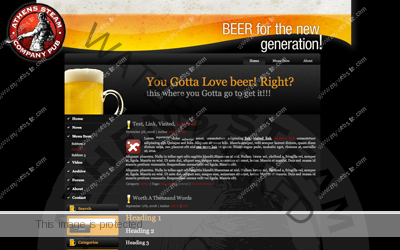
Fancy a Brew?
Another new template with a basic price tag of $40 (as is! no modifications in other words though it would be hard to use with the logo it has since the pub is a real one!!!! Oh dear me!) it is available from fluxink™ now.
You can check out a basic demo by clicking here. I like it and I hope you will too!
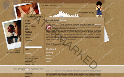
Another new blog template designed and demo ready!
Yes indeed. Over on fluxink™ I have uploaded another blog template, my latest entitled “The “C” Files”. This one was designed for my wife Cassi as an idea for her if she ever decides to get her cassi.com going. Just click on the image to go check it out!
It’s a design based on the now long lasting tradition of our Bad Mathematics site with a recycled theme. Here I used the wonderful new font facility from Google Font Directory which I have been raving about. The fonts I used on this site are the Droid family of Serif and sans serif fonts by Steve Matteson. Love them.
More excitement for me!
I’ve been looking into the whole idea of controlled font management on websites. It is a really tiresome fact that until recently getting custom fonts on your website was a complicated and annoying, and worst of all by no means a fail safe affair, especially given Internet Explorers classic arrogance of overriding everything to modify the web to its own preconditions..
You always ended up resorting to pixel images and, heaven forbid Flash text to get your site showing across platforms and browser types in a uniform and homogenous way. It is one of the most key facts that as far as graphic design is concerned the most basic foundation of good design is the way a designer chooses fonts to make the layout do what they intend to.
The internet sadly never made this easy till very recently. After the brave and brilliant effort by the folks at @font-face.com all that changed. Sadly their project was scuppered (more or less) by Google. Google the giant took one look at the idea and thought they liked it so much they would make their own bank of free accessible and open source fonts to enhance the web and finally bring control back to designers.
Google Fonts API, the web font service, now in Beta, is now a really amazing tool for freeing the designers from being stuck with the five or six font choices we’ve seen now for years on all websites.
Anyway follow the links in this post to see what the whole thing is about.
But as far as my work is concerned I just modified my site over on fluxink™ to implement my first open source font layout. I used the wonderful Yanone Kaffeesatz font site wide and it pleases me no end to have done so. Scoot over there and have look.
New template for F5!
Yes folks this simple, but I think very beautiful new template is one of my latest for WordPress and I am showcasing it here because I like it!
This is titled as simply “grey theme” to match it’s simplicity. I shall be making this available for sale as of today! The basic price for the template (compatible with WP up to version 3.0.1) is $30. Contact me if you want it to discuss specific customisations.
Thanks
fluxink™ up again!!!
Well this is getting to be a bad bad habit. fluxink™ is up yet again. Yes I had to build the whole thing again from scratch. My hosting service have apologised so many times that to be honest I feel a little sick!
But at least it is up and restructured! So for now I can say pretty much that it is back in business.
Fingers crossed indeed!
fluxink™ is down! Again!
And this time for serious! I am now in the process of complaints and angry exchanges with my hosting service for buggering up my site at fluxink.com.
Sadly this time it looks as though I will actually have to rebuild the site from scratch! so it will be down for a spate, a long spate.
More soon!
fluxink™ gets it’s first official commission!!!
Indeed. One is very excited and gratified to report the first proper commission coming in through fluxink™.com! Suffice to say there is a whole new site in development as I write. More very soon.
October 2010
SiMUNDO comes home! Finally
Oh yes this also fresh off the press! SiMUNDO is finally finished and up at its rightful home! Go see though it is still being filled with content, the site is running at its designated home address. Well nice!
fluxink™ introduces two brand new site designs!
So not only id fluxink™ up and running beautifully (I’m so proud) but also I have just posted my first two template designs for sale on there!!!!
One is the “Black&Yellow” theme. This theme is I think ideal for showcasing photographs, or high end products. It has a serious atmosphere and creates a weighty environment for techie discussion and so forth.
The other, “Da F” is a more fun blog, though it has a very dark interface it is in line with a lot of Gothic looking hip hop or rock sites.
I think it may well appeal to the more arcane user, maybe a discussion site for the Illuminati or some such thing. Who knows!
I’ve uploaded these demo sites and they are live and online. The two themes are two seriously dark themes, just to show I have more than one string to my instrument!
I will be uploading a whole range of design templates as time goes on. So if anyone is looking for seriously customised blog interfaces for their WordPress blog, just point them in my direction!
Thanks.
fluxink™ update!
I think fluxink™.com is now a genuinely working site. Now the hard part starts!!!!
Now I have to start the second phase, design having been, I think satisfactorily finished. I have to start making it visible and known on the internet so in fact it starts doing what it was designed to do… make money!
Yep it’s the nasty ‘M’ word! I set it up as a commercial site and now it’s finished and I am done tinkering with it, I have to start the hard nosed financial part. Price lists, and search engine propagation and so on!
Anyone who reads this, please know that I would deeply appreciate you telling others about fluxink™, putting links to me on your blogs and sites, letting anyone looking for good design know where the site is located.
It would be great if this thing gets going as soon as possible. All I need right now are a couple of well paid jobs to get the whole show kick started!
Also today I put up my first blog template that I am making commercially available over on fluxink™. It is called Black&Yellow and I think it looks pretty cool! You can go have look here.
Back in business over on fluxink™
Well folks, a week of manic, insomniac madness and it seems fluxink™ is back up and running. Now the really hard work of finishing it starts. But I am working on it.
Meanwhile there are one or two other projects that will be requiring my constant attention, so I hope whoever wishes to use my services would be patient!
Complete revamp for SiMUNDO
I have been pulling a few all-nighters trying to make a decision about how the SiMUNDO site should be redesigned.
The fact is when you first conceive a site often you’re basically only dealing with the initial impressions of what the site would/should be like. In reality, once the actual content begins to come in your initial concepts sometimes begin to show their weaknesses. This is one reason why site development is very much about testing, testing, testing! Richard Aras, the owner of SiMUNDO and I have been doing just that for the last few months. But the more we tried it the less likely it seemed that the original design was going to serve the purpose for which we needed the site.
So from the first beta, made entirely in static form I took it to the next level without much change to the graphics by loading the interface unto a WordPress backend. Now the functionality was much more what we were looking for, since this is a site that will hopefully go on and expand to imperial sizes.
Now though while we developed content I became more and more unhappy with the original design grid and palette. First thing that really started bothering me was the original three column grid. It simply was not giving me enough space to make the content appear coherently on the site. It was just too cramped. So I took it to a two column grid. This helped a lot with space and clarity. But the colour range was too imposing for the kind of content we were going to load into the site, the coloured sheets simply made the use of images and colours too restrictive for an ever expanding, live site.
As sometimes happens, the more I looked at my original design in context, the less I liked it. But as also happens I felt stuck with the original concept. I had a real problem modifying the original conceptual colour ideas into something more useful and appropriate for the site. This is a site with an overload of informational text. Much science and technical data, data that has to be presented clearly and without interruption or distraction. This meant that having the very upfront and imposing colour range I had chosen for the layout was simply too unwieldy for the project in practice.
I had a few sleepless nights rethinking the design around my original palette, but I simply could not make it match the requirements of the project. So I decided to throw out the bath water and the baby and start over on the basics.
You see with every site you design much like any publication, it isn’t ever just a matter of a nice looking piece of visual candy. The first and most important job of a graphic designer is to make the product he is designing for be showcased in the most advantageous and appropriate manner for that specific thing. In other words applied design must always be to a good extent subordinate to the purpose of the thing it dresses and presents.
So rethinking was needed badly here. And rethink I did. I have now come up with a layout that for me covers most if not all the angles on the requirements of SiMUNDO. The thing about this project is that on the one hand it is a massively high end scientific proposition which needs to communicate in deep detail with scientists, engineers and technical folk. Yet the site needs also to communicate well with the interested layman. It must contain and cover both ends of the spectrum. On the one hand it needs to be attractive and high profile and modern. On the other it must not appear flippant or lack in seriousness. These qualities must be absolutely reflected by the graphic design of the site. So it is necessary for it to balance the feel and look of a commercial site, a scientific-academic site, satisfy the needs and answer the questions of the layman as well as the specialist, while remaining appealing to potential financiers and captains of industry… A tall order indeed.
But I think I have finally managed to reach a balance on the design front. Now it’s all development, development and tweaking it to a fine point so that it can finally go live. You can go and review it on my test URL and make your own mind up. The test site is changing almost on an hourly basis so it will require regular visits.
Exciting new development for me! A whole new domain!!!
Yes I am excited to all hell. It has been my intention for a long time to have my own complete domain, exclusively dedicated not only to showcasing my work, but to have direct contact with potential clients in order to work independently of national borders, worldwide. Now the dream is a reality.
The place is fluxink™.com
I am in the process of setting it up. But the first appearance has been made. You can go have peek right now.
So a new brand is born and I hope I can start providing design, illustration and photographic services as well as web design and the sale of customised web templates through my new site… More as soon as it is fully functioning.
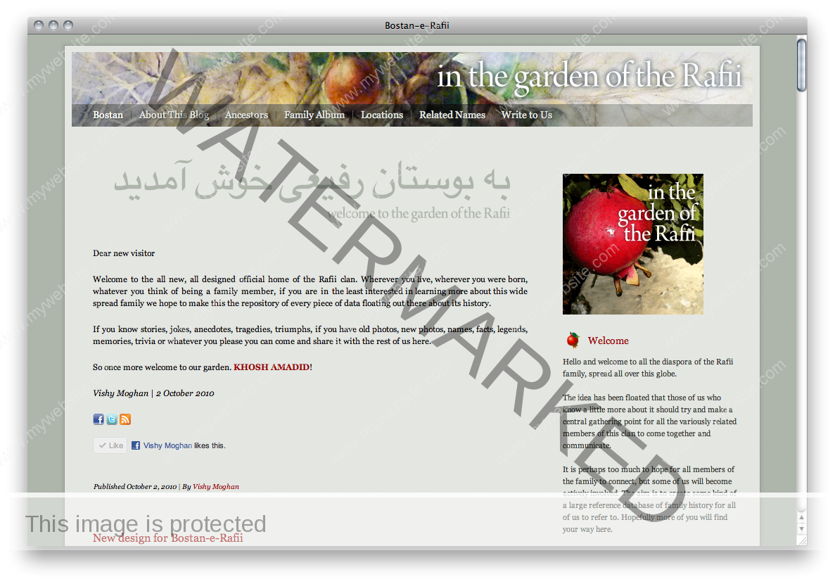
New blog on line
Well I finalised the design and uploaded the brand new blog/website for the family Rafii, today. It’s looking good and working really well!
The Rafii are a huge Iranian family spread throughout the world and Bostan-e-Raffi (that means the garden of the Rafii in Farsi) is designed to be a central forum/archive/knowledge base/virtual gathering place for bringing this family together again.
September 2010
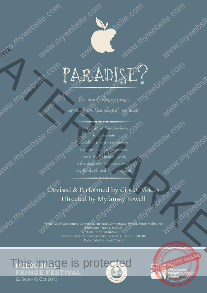
Work that didn’t make it through!
This is a poster I designed for the play Paradise? for a theatre company in Melbourne, Australia.
It was my favourite proposal.
They didn’t take it. But I would really like to have seen this go up! Some you lose.
Although the one they did choose was pretty good too!
An idea for a new book of photographs
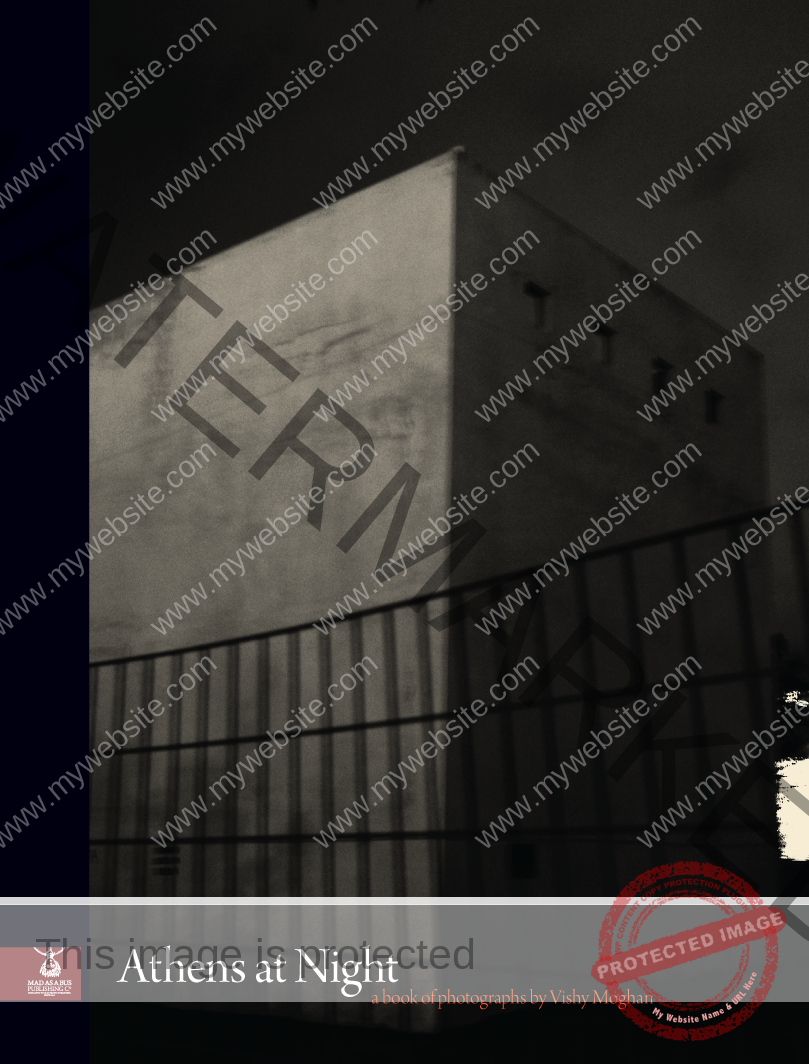 In collating all my work over the past few months I have been gathering my rather dispersed portfolio of photographs.
The upshot is that now I have found all the components of various project series I’ve been doing over the last four or five years.
One of these is a long running, occasional project of photographs of Athens at night.
I think it would make a very neat little record of the city. Especially if I make it in the form of an eBook, which would tie it in nicely with my other project Mad as a Bus publishing Co.
Above is an idea for the cover.
SiMUNDO™: A new rethink
Well in showing the new idea towards a logo redesign, the project leader believes that we should stay with image of the mark. So below are some re-works of the original idea.
![]()
The second idea is a combination of some previous designs too…
![]()
And so the story goes on!!! More soon.
SiMUNDO™: A slight rethink?
") I’ve been thinking the logo for SiMUNDO™ over again.
I’ve been thinking the logo for SiMUNDO™ over again.
I have worried for ever that the logo as a logo may not be quite representative enough.
So in thinking it over I’ve been mulling over this design:
Now this is not meant as the final proposal, yet. But I am thinking about it along these lines.
There are several mitigating circumstances for this rethink. Not the least important is the fact that when type is too bold it looks blocked when reduced in size.
Add to that the fact that the mark and the sub header/slogan in the present version of the logo (as illustrated in the last post) are much lighter, led me to feel very uncomfortable about the logo and its pliability of usage.
I also think that in retrospect the more elaborate mark below, though directly based on the design of the engineering aspect of the project, is still rather lacking as a general mark. Too complex and far too fine in line, it simply refuses to be readable when seen in small sizes.
So I am now proposing this to Richard, the project leader of SiMUNDO as an alternative route to the logo before we finally go live with the project.
Below are some black variations on the above theme.
 variations")
SiMUNDO™… things are hotting up
SiMUNDO™ is a scientific project that I am involved in for the last few months. Mainly of course as designer. I have been in the process of not only building and developing a website for it, but also generally looking after the project design.
It is a very exciting and possibly crucial project. Right now though it is a little on the hush-hush side. All I can report for now is that it is involved in cutting edge design for the science and technology of geo-mapping.
So for now I’ll just post the logo that I designed for it… Later on I shall give more details. I am really looking forward to the launch of this project in public.
The type was originally drawn by the project leader, Richard Aras, before I came into it. When we discussed it we decided that we should retain the typo of SiMUNDO™ as is. I simply redesigned the letters to make them a little softer and improved the tracking and so forth.
I added the tag “BIG SCIENCE • BIG SOLUTIONS” because I felt it needed a little explaining to clarify the rather opaque title. The mark was derived from a characteristic part of the engineering aspect of the project.
![]()
The colour palette was designed based on geo-colours. Since the project is a massive environmental science effort and the fact that the engineering drawings were so inspiring I felt we should couple a palette of earth colours with the geometric structure of the design.
Below is the palette designed for the project, drawing its inspiration from the strata of the planet.
![]()
Two more running jobs
 There are two more running projects right now for a client in Germany.
They both have to do with food and diet. Fine dining is in a class of its own as far as design is concerned.
One is a company dedicated to creating a high quality online delicatessen, soon to appear on your friendly neighbourhood worldwide web.
Logo (below) made and approved.
![]()
and here’s the little mark that I designed for it as an avatar:
![]()
And of course the website:
The other is an organisation formed with the express brief to promote healthy eating and drinking, the logo (below) has just been approved

More soon once these two are fully operational.
New Logo in the works
![]()
Here is a logo I’m working on for a new security firm in England.
And I thought I’d preview it here. There is also a website in the process of being made.
Final work will be posted.


![]()
OK here are some colour ideas for this logo. The client apparently loved it on sight. Now it’s the working out of details. This is the longest bit for me usually. Talking the client through how they see the “FEEL” of their company.
Now it’s time for that feel. What would show the company to have the qualities the client wants.
In this case we’re looking for :
- Seriousness
- Reliability
- Discretion
- Classicism
- Trustworthiness
- Reassuringly traditional, yet Modern looking
- Tech savviness
- Honesty
So which of the above colour combinations represent the largest number of those qualities and requirements?
We’ve established the seriousness and so forth of the nature of the business.
We’ve combined serif and ever so slightly modified sans serif fonts to give it that traditional yet so now feel.
We’ve used heavy dignified colours to emphasise reliability and seriousness.
We’ve made a mark that shows the principal in the centre of a quadrant of protection, it can also be used as an abstract image to remember the company by.
However as a shape it is a difficult to avoid reminding people of Fascist symbolism!!!
Strangely enough the mark looked more like a swastika when it sat on it base as a square than it does once I tipped it up on it’s corner!
The five segment square was what the client wanted. In fact the only thing he insisted on.
But now I have made it, much to my surprise, the more I look at it the better I like it as a whole.
I am waiting for the clients to let me know what he thinks about the colour palette!
![]()